

Imagine the vibe you get sitting on that pretty swing in the living room, dressed in soothing blues, overlooking the mill lands. I can feel the sand on my toes, the sound of the ocean, and gentle wind blowing through my hair caressing the face.
This 1,500 sq.ft, 3 BHK apartment in Central Mumbai belongs to a family of four avid trekker-travelers; their heart lies in the hills, but the home is infused with breezy colors and patterns giving the feeling one is on an extended coastal vacation. It is a fine example of how one’s wanderlust can influence a home’s interiors.
deCoDe architecture has designed and executed this apartment. Their brilliant work has been featured time and again on the blog. This project is again stamped with their characteristic modern touch and attention to intricate detailing. No element seems out of place from the major pieces of furniture like the swing to finer details such as matching the blue upholstery to the artwork, or the inlay tiles in the storage cabinet by the dining table.
About the project:
Type: A 3-BHK apartment for a family of four
Location: Parel, Mumbai
Area: 1,500 sq.ft
1. What was the brief from the client?
The client brief was very clear and straightforward. They were a family that loved the outdoors with each member of the family being an avid trekker amongst other hobbies. They wanted a home that would reflect their love for the outdoors and did not want any form of pretension in the home in the form of material used for anything other than it’s intended purpose. This forced us to rethink even our own approach to minimal material and space design. The eventual result was a reflection of both – the client’s vision for the home and our aesthetic response to the same.
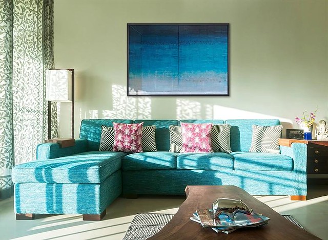
2. The colors feel like one we are in a beach side home – so refreshing. Was it a conscious choice to go sea green and turquoise?
We do not generally use a lot of bright colors in our work. Our work tends to be quiet and focus more on amplifying the existing natural factors such as the sunlight, views and the natural breeze that the apartment enjoyed. We feel colors such as sea green and aqua are quiet colors that help complement natural light and we try to use them as accents through the entire space. Another detail that is not very visible in the images is the use of lime plaster instead of paint on all the walls in the home. The lime plaster feels soft to the touch and is used in colors that complement the pastels of the accents.
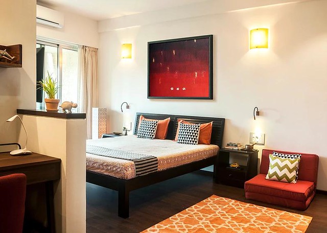
Living Room
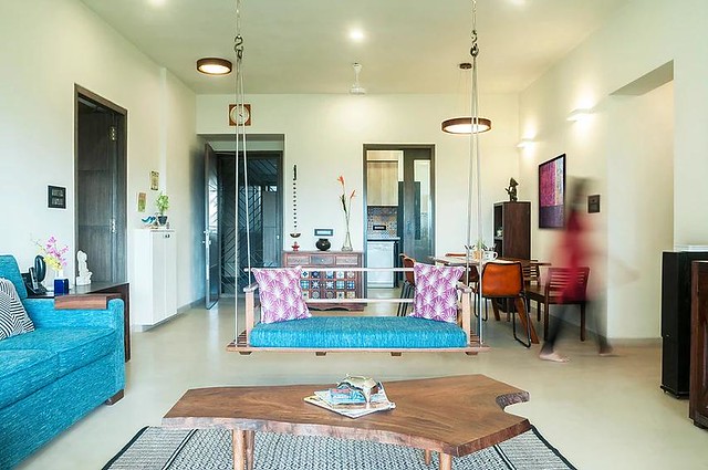
3. I can’t take my eyes off that swing ..I’m sure you had your conversations around it when designing? So let us pick your brains :)
The family had a tradition of having their morning cup of tea and catching up on the morning news sitting on a swing and staring out of a window. This was the ten minutes of calm that they had in their entire day. So a swing had to be the centre of all activity in the living room. There were many discussions on the design of the swing and it’s location. Eventually, we went with a design in simple lines that complemented the simplicity of the home and located it such that it literally became the focal point of the home and divided the rather large living space into the gathering zone and the dining zone.
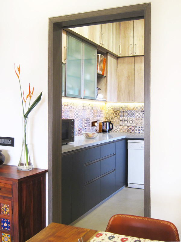
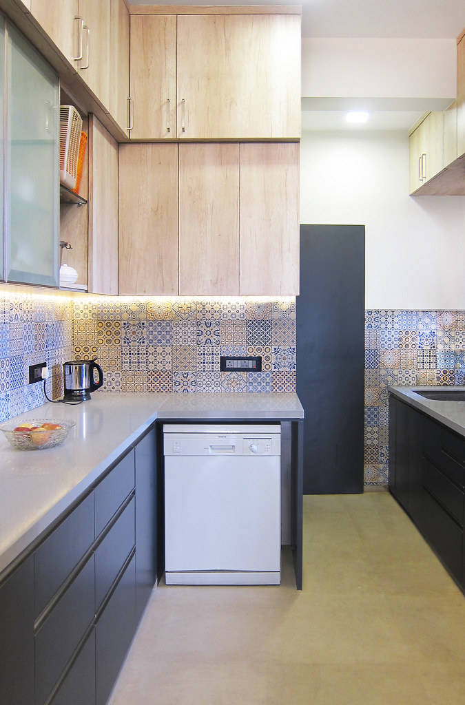
Dining and Kitchen
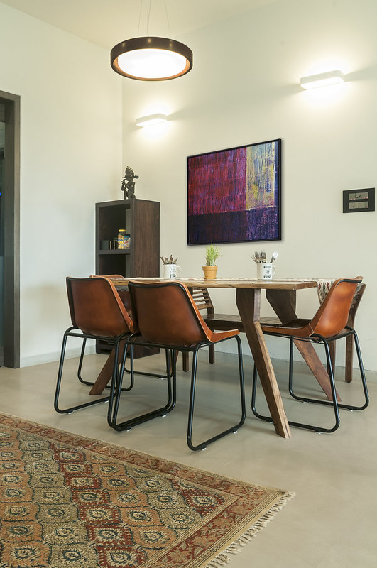
4. That dining table has stunning legs. Is it custom made or bought?
The dining table was sourced online after a lot of research for a table that was rustic yet modern. This one fit the bill perfectly. It is the Sorano 6-seater dining table from Pepperfry.
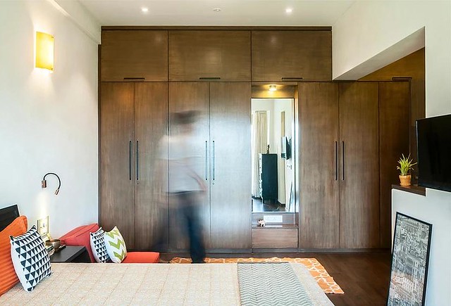
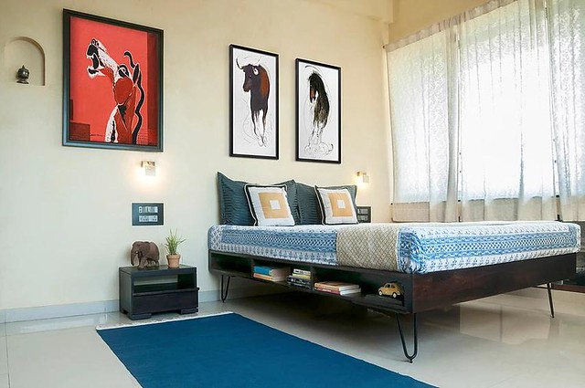
Master Bedroom
5. Any challenges in particular?
The project was a fun challenge. The clients were rightfully demanding in their vision and wanted a home that fully reflected their multiple personalities and fulfilled their functional requirements. All projects are different and challenging in their own ways and this was the same. Our biggest challenge generally with any project is living up to our own expectations J
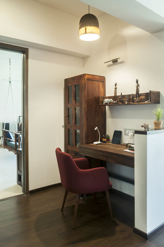

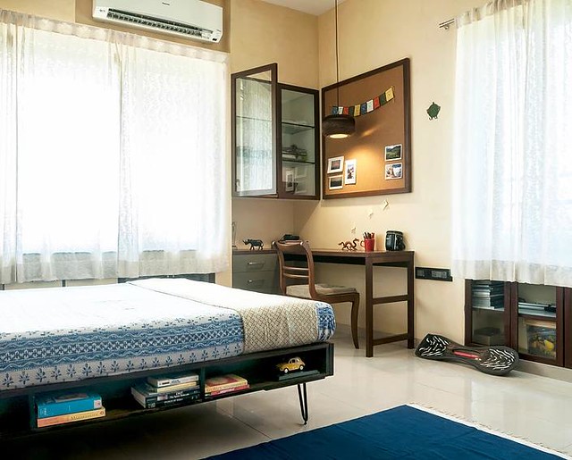
Children’s Bedroom
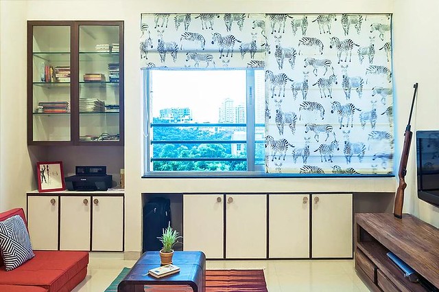
6. And finally some thoughts on the artwork? I see a lot of animals prints everywhere.
We feel art in a home is a necessity and not a luxury, however small the home may be. The artwork is this home is a reflection of the multiple spaces within the home and the personalities of the people who inhabit these spaces. The living room has abstract “quiet” artwork that helps calm the home while the master bedroom has more intimate, vibrant artwork. The animal prints are a reflection of the elder son who is a brilliant wildlife photographer and avid traveler and he loves nature and animals.
The color scheme of every room is different but they flow seamlessly and never does it feel any corner feel disjointed from the rest of the home. Memories from travels find their coveted space in wall art and reinforcements in furnishing in the children’s bedroom.
If there was one element I absolutely adored in this house, it has to be the swing with that killer view. But, that’s just me. I’m sure you will have tons more to bookmark, scroll back and forth till you have had enough. And, I’m saying that from my experience over the past few days.
You loved this project, didn’t you?
And yearning to see some more executed by deCoDe ? Well, here you go…
A modern curated home in Bangalore
Image Courtesy: deCoDe Architecture
7 Comments
Everything is so well planned . The shelf attached to bed in children’s bedroom looks innovative also it saves space for extra shelf.
That swing is a really cool idea.
Thanks for this excellent home decor ideas.
Visitor Rating: 5 Stars
Visitor Rating: 4 Stars
Visitor Rating: 4 Stars
Visitor Rating: 5 Stars