What makes a home tour endearing to watch for you?
The deciding factor for me is often one picture, I would have got a fleeting glance of, on some medium. And, more often than not, I will delightfully discover this picture was just the tip of the iceberg as more goodness lies buried underneath in layers all over the house.
It’s the little details that sets apart a thoughtfully conceived one from one put together hastily. You will pleasantly unearth many such details in this renovated apartment designed by Studio M Design.
About the home:
Type: 3 BHK apartment for a family of six.
Location: Surat, Gujarat
Construction: Renovated
Design Aesthetic: Scandinavian
Designer: Studio-M Design led by Moiz Faizulla
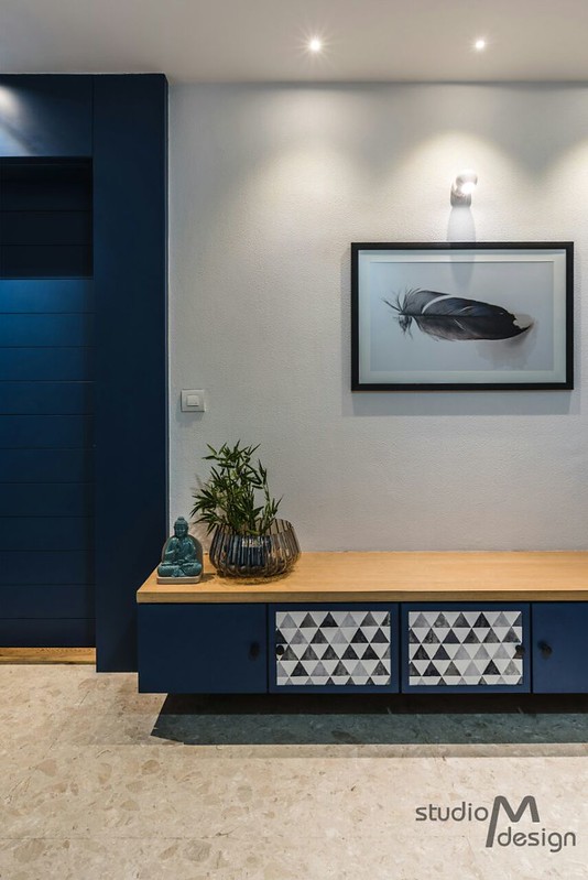
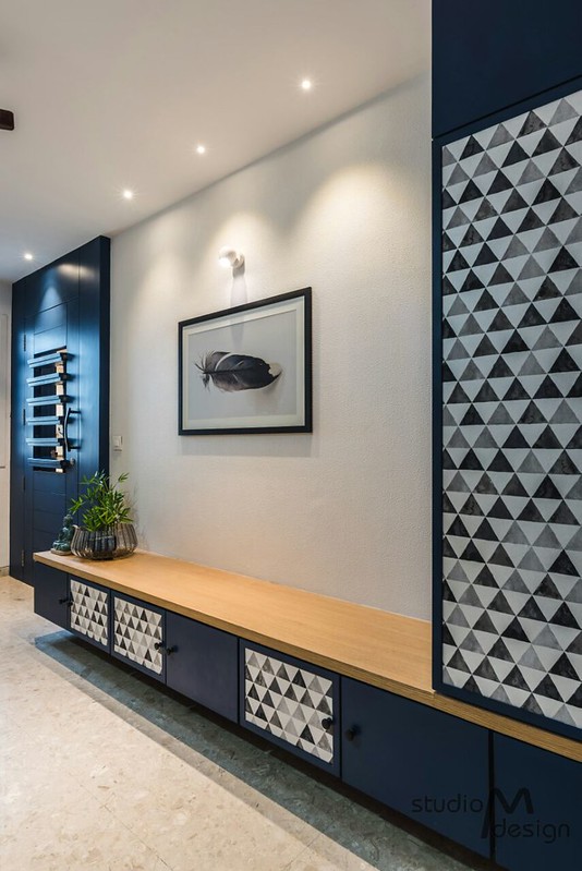
Imagine being greeted to a home with its front door painted Indigo. Bold and beautiful? You bet. And now, imagine the bright color continuing into the foyer. This home pulls off one such act with with ease and panache in equal measures.
What was the brief from the client?
I know you would have loved to see the before-after pictures of this apartment. This apartment, in its earlier avatar, was what any home would look like: with disparate pieces of furniture all around the home bought as and when need arose. Studio-M stepped in to give it a new restrained look, while retaining the layout.
The family was already living in this apartment before they approached us with the idea of renovating. They were already familiar with the spatial layout. Our mandate was to change the overall look while keeping it simple with minimum use of paneling materials.
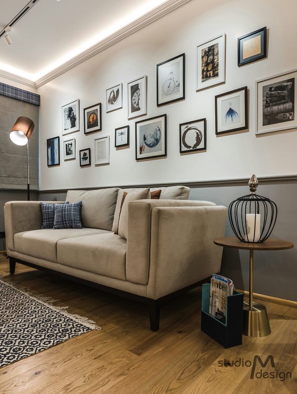
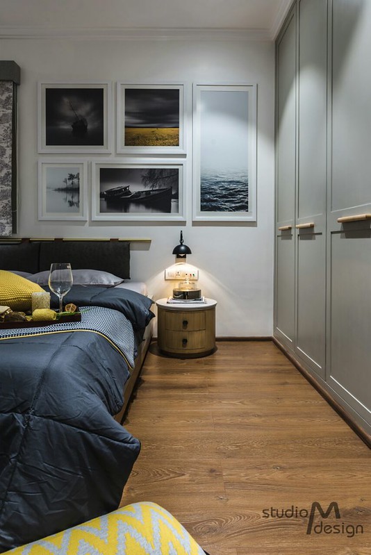
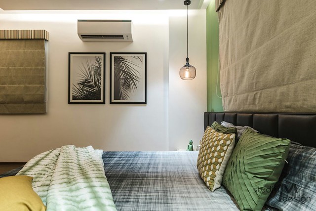
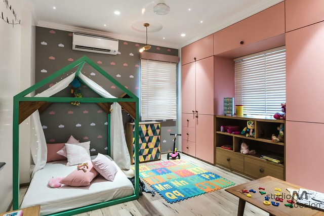
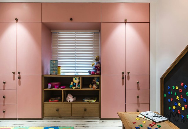
This brief was enough for us to create a mood board with emphasis on using different colours and fabrics in decor. Every room has been assigned a separate colour palette which is elegant and at the same time soothing. Pink and mint green colour for the kids room, green for the master bedroom, yellow and grey for parents room and pinch of blues in the living room. A gallery of frame collages have been used extensively throughout the house which again reflects the colour palette in the respective areas.
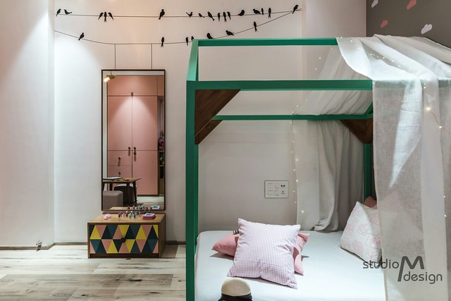
The geometric pattern you see on the doors is a wallpaper that offsets the monotony of a solid color.
Living Room
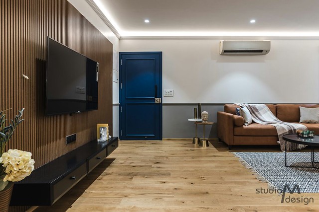
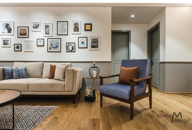
Here is the reveal: it was this dual toned grey and white living room that tugged at my heartstrings making me want to explore this home further. It kind of reminded me of olden homes that had a different colored distemper in the lower half. So, yes, it was nostalgia that got me.
The living room is minimal in design with subtle hues of earthen color coming from the sofa and the coffee table. The colors blend beautifully and reinforce the surrounding colors without standing out. That Indigo chair would have looked out of place, but here, it is a continuation of the color scheme.
Notice the wooden back paneling of the TV.
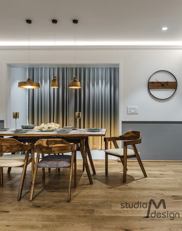
The grey curtains blend with the wall color. The showstopper, however, are the copper pendant lamps that complement the marble finish table top. The chairs have that rustic wooden grains of the flooring.
Master Bedroom
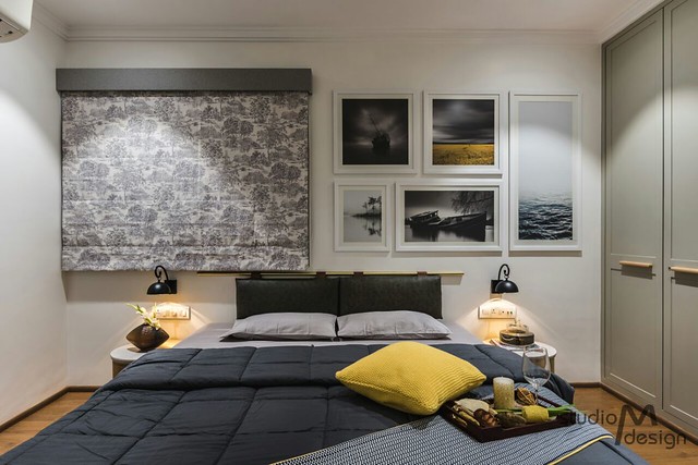
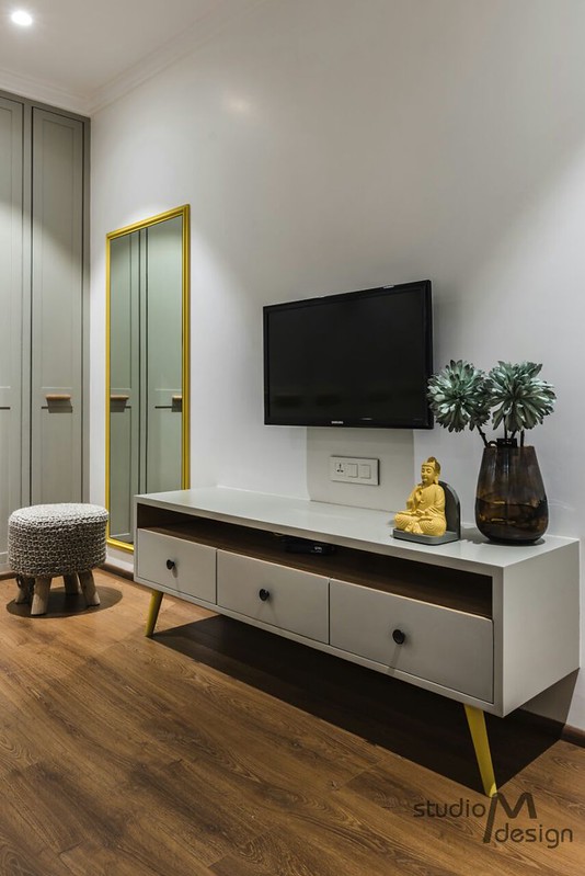
If there was one takeaway for you from this home, it would be how to work with grey. Grey is the predominant color, but other complementary colors are subtly introduced everywhere — like the yellow below in the master bedroom. I love the molding to the panels in wardrobe doors and the dual color in the living room.


Kids Room
This is little detail I was talking about earlier to make it personal. Did the scene of birds sitting on a clothes line mimicked here put a smile on your face? I bet that is one idea you will want to mimic.
 This home to me was yet another illustration of why you need an interior designer to visualize and tie all the pieces together in a frame. Fabrics, flooring, wall color, artifacts, wallpaper – so that they don’t appear as disjointed pieces when complete.
Image courtesy: Studio M

Comments
Visitor Rating: 5 Stars
Visitor Rating: 5 Stars
Visitor Rating: 4 Stars