We have another Mumbai apartment today designed by Studio Node that is traditional in design but modern in outlook and comfort. Remember the hugely popular 800 sq.ft vibrant blue apartment designed by them?
The style of this apartment is something all of us will instantly relate to. If you ask any new homeowner, what kind of a design style do you prefer, it’s unrealistic to expect a clear answer like “modern,” rustic”, or “contemporary”. Even when you do get a straight answer, the ideas in one’s head are always a combination of elements we’ve related to or aspired to some point in our lives. For instance, as much as I like a clean slate, minimalist look, the heart always longs to have yazhis or oonjals and pillars in the house.
This house is a fine example of balancing tastes without drawing hard boundaries on any one aesthetic. More practical in approach with a human touch, I would say.
About the project
Location: Hiranandani Gardens, Powai, Mumbai
Size: 1050 Sq.ft
Type: Apartment
Designed by: Namrata Kaur of Studio Node
Design aesthetic: a combination of Indian design and modern outlook
Colour scheme: pastel
Everything in the project is custom-made or sourced from the furniture to handles and knobs as per the color and design preferences.
From brief to realization
The apartment came with crooked, curved walls and too many dead ducts. The transformation of such an apartment into this earthy, aesthetic living environment with a high degree of bespoke detailing is mind blowing.
The client’s brief was succinct: a home adorned in traditional Indian design with gentle carvings and light colors; has a lot of storage and ample seating in the living room.
Namrata, the co-founder of Studio Node says:
Having said this, she was also open to doing something different and unique, and gave the designers the freedom to style the space to the fullest, with the right accessories. Simply put, the project could be Indian in spirit and modern in outlook.
How to use dead spaces in an apartment
This apartment can be a case study in understanding how to make the most of dead spaces and ducts. They took down a few well to open up the space thereby incorporating the wasted, unused spaces into the usable footprint.
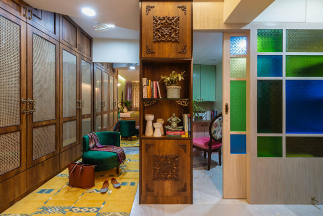
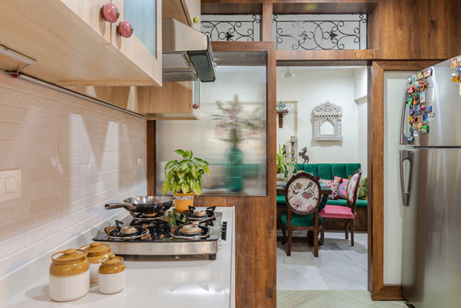
The architects opened up the kitchen by adding a glass partition and removing the wall. The reclaimed dead duct spaces instead now accommodate walk-in wardrobes and a study. How novel!
The colorful glass partition is one of my favorite spots in this house.
 Colour scheme
On how the architects brought the desired earthiness and rusticity to the home, Namrata says:
these were rendered using a lot of Indian elements and materials, albeit in a contemporary manner. Additionally, it was also decided to infuse the home with a bohemian, youthful personality.
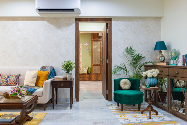
The aesthetic pivot, of course, were the colours. The entire house uses a liberal mix of mint, baby pink and teal. These are offset by olive green and mustard to create the required vibrancy. The use of wood brings in the warmth.
Kitchen
The kitchen is the favorite space of the client in the house. Designed in light colors to make the space look cheerful and bigger in size, it is basic in design and functional in line with the rest of the house. the old-world charm that pervades the rest of the home can be seen here too.
The lighting throughout the houses uses basic mood lighting to highlight upholstery or certain areas; it stays away from anything fancy or ornate. 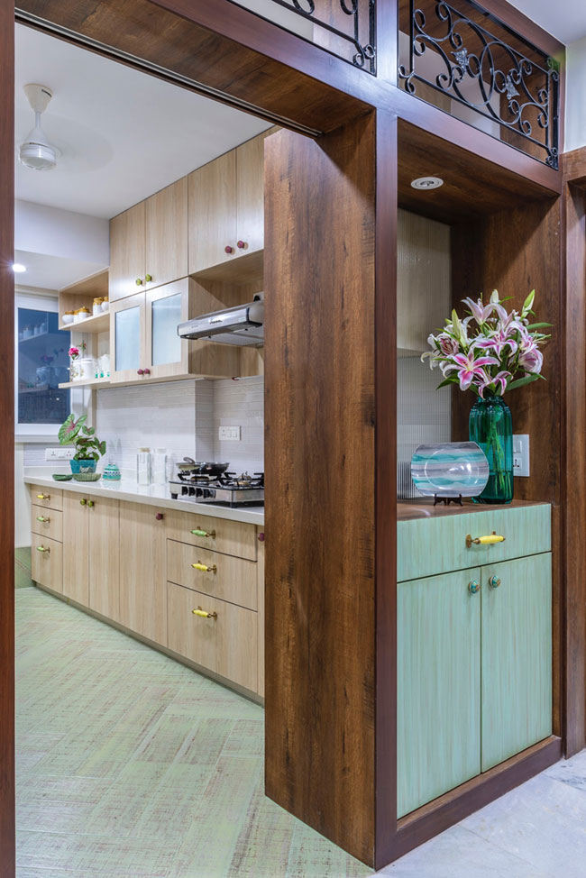
 Bedrooms
The house came with two bedrooms: a master bedroom with an attached balcony and a guest room. The architects created a walk-in wardrobe delineated by a wood-and-glass partition with blinds in the master bedroom. The partition served a dual purpose: privacy when needed while opening it let it air and light. The guest room has a compact study/work area.
There is an old world charm to these bedrooms which comes from the choice of bed and the finish of wardrobes. Both the wardrobes with traditional overtones: one set uses cane shutters while the other features fabric sandwiched in glass.
The headboard of the bed is made up of cane, too. 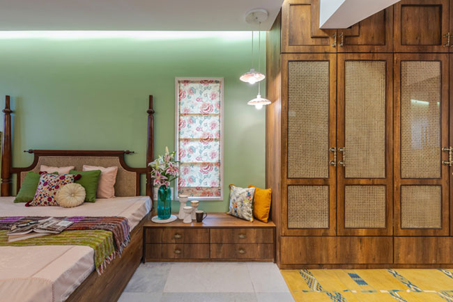

 Improvisation wins
The challenge in any project is to balance form and function ;aesthetics and utility. And that starts from the smalls of things like upholstery colors.
The furnishing in every room reflects the amount of natural light that space receives.
The architect says, “the key to staying on top of the game was a continued deliberation on design — re-thinking and re-visiting it constantly and brushing up the detailing at every stage. It out made us more confident and satisfied the client too,”
I couldn’t agree more.
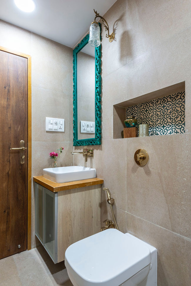 Image courtesy: Photographix / Ira Gosalia
Shop the look:
Jharokha (non-stained): there’s a white one hanging on the dining wall.




Comments
Visitor Rating: 3 Stars
Visitor Rating: 5 Stars
Visitor Rating: 3 Stars
Visitor Rating: 3 Stars
Visitor Rating: 1 Stars
Visitor Rating: 2 Stars
Visitor Rating: 2 Stars
Visitor Rating: 1 Stars
Visitor Rating: 4 Stars
Visitor Rating: 5 Stars
Visitor Rating: 5 Stars
Visitor Rating: 5 Stars
Visitor Rating: 5 Stars
Visitor Rating: 4 Stars
Visitor Rating: 5 Stars
Visitor Rating: 5 Stars
Visitor Rating: 4 Stars
Visitor Rating: 5 Stars
Visitor Rating: 5 Stars
Visitor Rating: 5 Stars
Visitor Rating: 5 Stars
Visitor Rating: 5 Stars
Visitor Rating: 3 Stars
Visitor Rating: 3 Stars
Visitor Rating: 5 Stars
Visitor Rating: 5 Stars
Visitor Rating: 5 Stars
Visitor Rating: 4 Stars
Visitor Rating: 1 Stars
Visitor Rating: 3 Stars
Visitor Rating: 5 Stars
Visitor Rating: 5 Stars
Visitor Rating: 4 Stars
Visitor Rating: 3 Stars
Visitor Rating: 4 Stars
Visitor Rating: 2 Stars
Visitor Rating: 5 Stars
Visitor Rating: 5 Stars